In the last blog we published, Niels talked about the technical aspect of world construction within the game Lumini (if you missed it, you can read it here). This week I, Olof, will talk about the visual side of building the world in which Lumini takes place.
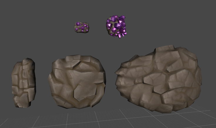
As Niels explained, the world in Lumini is made up out of separate assets. Our asset tool set consists of a large number of smaller chunks that can be used to smoothly put together different environments. To build a mountain, for example, we would make a set of rocks in different shapes and sizes and then I would use them to build a complete mountain in a certain shape. The upside of having a number of small assets, is that you can build any shape you want, without having to make unique assets for every specific situation.
Of course, making such a tool set of assets also has a downside. Each asset needs to look good from all the required angles, in order for us to be able to use it in all types of environments. The more different uses for an asset, the better.
Our assets are separated into a number of different categories. The first category is building blocks that form the base of the world. These would be assets such as rocks and parts of buildings, that can be used to create mountains or cities. We also have decorative assets. These are generally placed on top of the building blocks to add detail and flavor. Examples are plants or crystal clusters. Finally we have interactive assets. These are assets that have a direct gameplay impact. These would be objects such as doors that can be opened, or spikes on which the players can hurt themselves. All these assets are needed to make a complete, living world.
Here are five different assets.
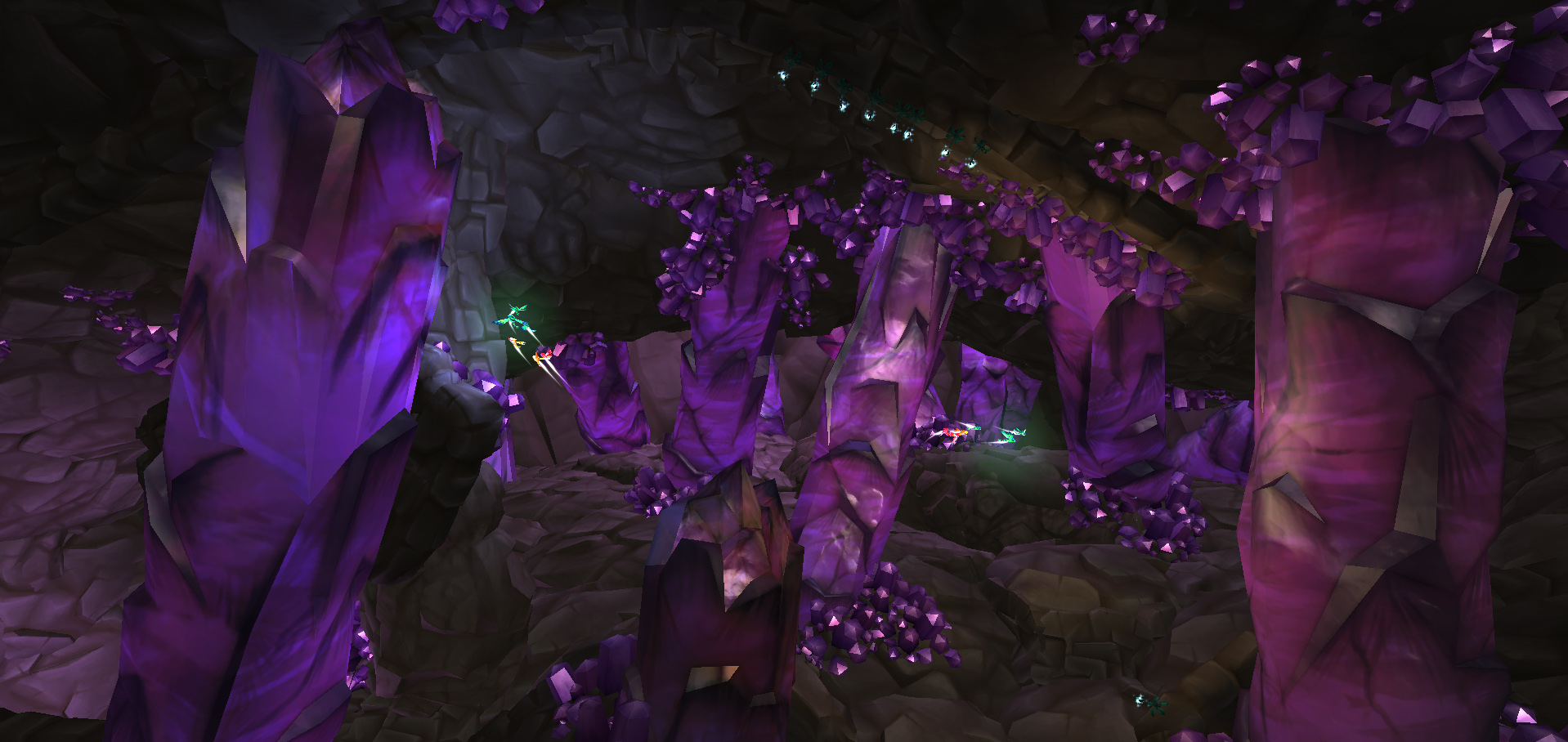
Here is a small environment made from these five assets.
With a limited number of assets we can make a wide range of different looking areas. We mostly use the same basic tool set to build different worlds, although we also need to add some assets that are unique to a specific environment to give that location its own flavor.
In this picture we used the standard rock asset with three crystal assets to give it flavor.
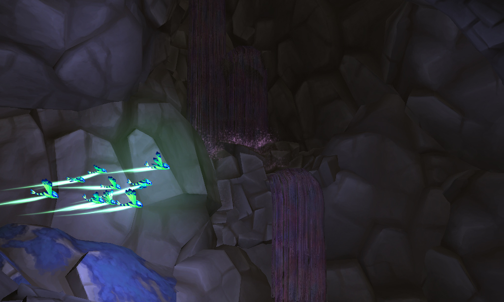
In this picture we used the same rock assets with some different lighting and fog effects. Now this area looks completely different without needing too many new assets.
Function isn’t everything of course. The look and feel of individual assets as well as the completed environments is equally important. Because in Lumini the visual experience is a large part of what makes the game interesting. The art leans slightly towards a cartoony, painterly style. This is because leaving out smaller details, which you would see in a more realistic setting, gives the shapes in the game more clarity. The painterly style serves to give the game a soft, friendly look, that helps with the flowing feel of Lumini.
Color is also an important aspect. The types of colors one uses has a lot of impact on what sort of emotion a certain visual conveys. We used mostly softer blue and purple colors for elements that are friendly early on in the game. The Lumini themselves have a lot of blue and purple in them as well. Having other elements mirror these colors such as in checkpoints, the player will then have positive feedback associated with these colors. However, for harmful and dangerous elements, we often use harsher colors such as red and orange. In our enemy designs we make sure that they have at least an element of red somewhere to signify the danger it brings.
A muncher, one of our enemies.
Next time Michiel will talk about how these assets and environments are used to create a visual narrative through environmental storytelling.
- Olof Moleman


